
AI-Enabled Cervical Cancer Screening Interface
Cervical cancer is preventable and treatable, but it still claims 340,000 lives a year, mostly in low- and middle-income countries (LMICs) where access to screening is limited. The team initially built a smartphone-based Automated Visual Evaluation (AVE) app powered by AI to help healthcare workers detect precancerous lesions more accurately, but discovered there was room for more iteration.
Designer: Jake Richards
Duration: Two-month design sprint
Scope: Native iOS application, starting from user research to an iterated high-fidelity prototype
Responsibilities: Sketches, wireframing, prototyping, iterations, design conversion
Tools: Figma, Squareline Studios
Rediscovering and Redefining the Problem
After the development of the smartphone app, the team conducted usabability testing to see how effectively it was working. To do so, they:
Talked to clinical trial leaders in six countries to understand how AVE was being used in the field
Ran a simulated-use study with OB/GYN Dr. Kristen Austin, who has experience in LMIC settings
With the new round of research completed, there were key takeaways.
1
Gloves + Touchscreen = Bad Combo
2
One-Handed Use is Needed
3
Unique Clinic Setups Call for Tool Consistency
4
Clinicians Want to Test Automatically AND Manually
While the AVE smartphone app improved accuracy, usability issues made it clear we needed to rethink the whole experience. Swapping gloves frequently is a waste of both time and money, and not being to use the app in one hand while holding a speculum in the other made testing difficult. We also couldn’t expect all clinics to be set up with the same lighting or additional spaces, so providing some sort of exam consistency through the device itself was needed. Lastly, clinicians are trained to run these exams and trust their judgement more than a new algorithm, so finding a balance between the two would be ideal.
Even with improved test accuracy, usability issues made it clear that it was time to rethink the experience, and come to a new problem statement,
“Healthcare providers needed a better, easier-to-use, and more affordable tool that fits into real-world clinical workflows.”
Designing and Iterations
With our problem redefined, it was time to iterate on the combined hardware and software designs. Our insights told us what was most important to include
Resistive Touchscreen — Works with gloves, no more mid-exam glove swaps
One-Handed Usability — A small device that’s easy to hold, provides light, and doesn’t need an assistant
Easy to Clean — Built with materials that can handle real-world cleaning methods like alcohol wipes
Big, Simple Buttons — No small icons or tricky menus; just a simple workflow with clear headings that’s easy to interact with
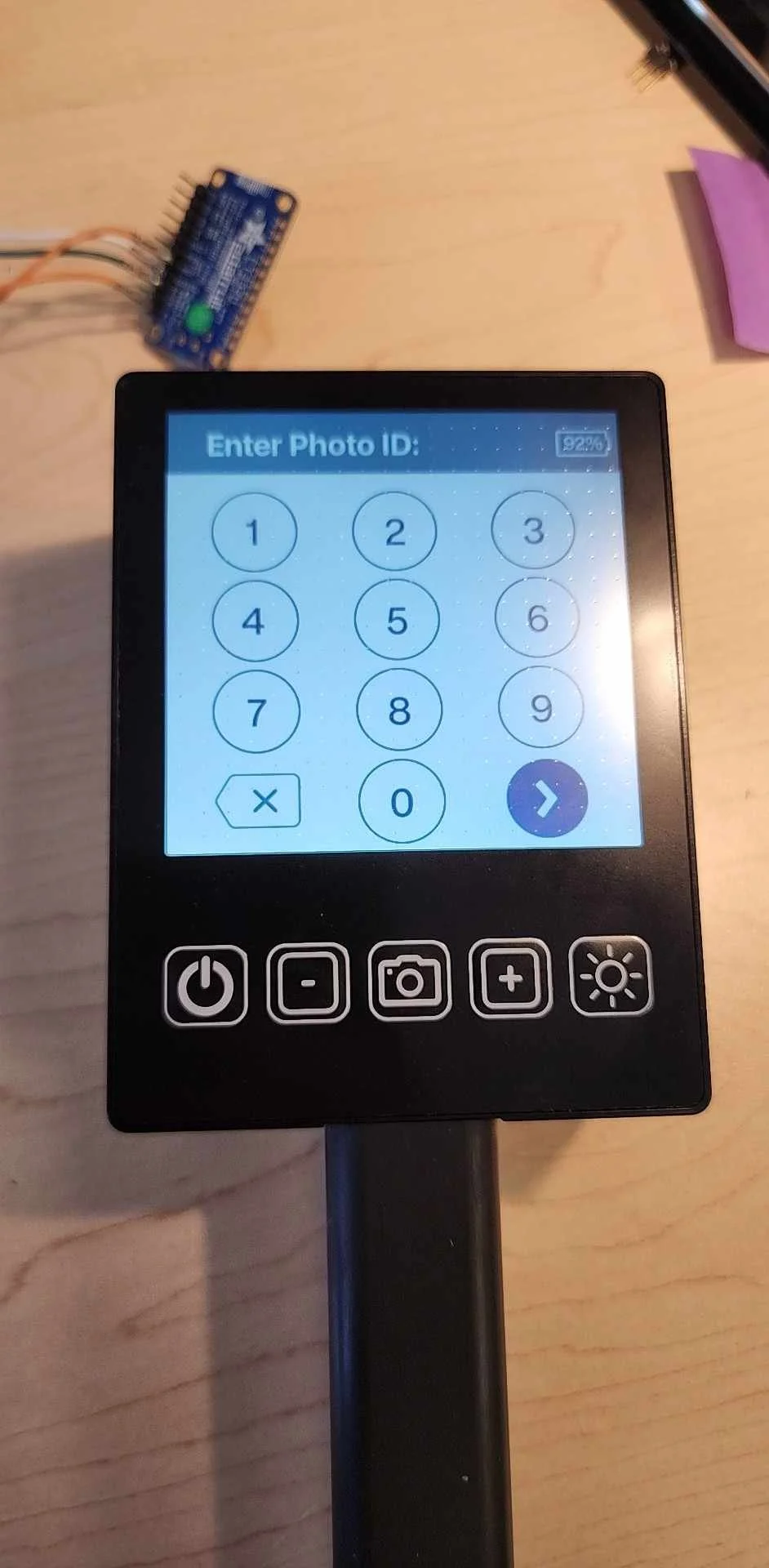
While a different team focused on the hardware, I began working on the updated software experience. The flow from the smartphone app would remain the same, allowing the clinician to enter the patient’s unique identifier, followed by their current conditions, after which the exam would take place automatically.
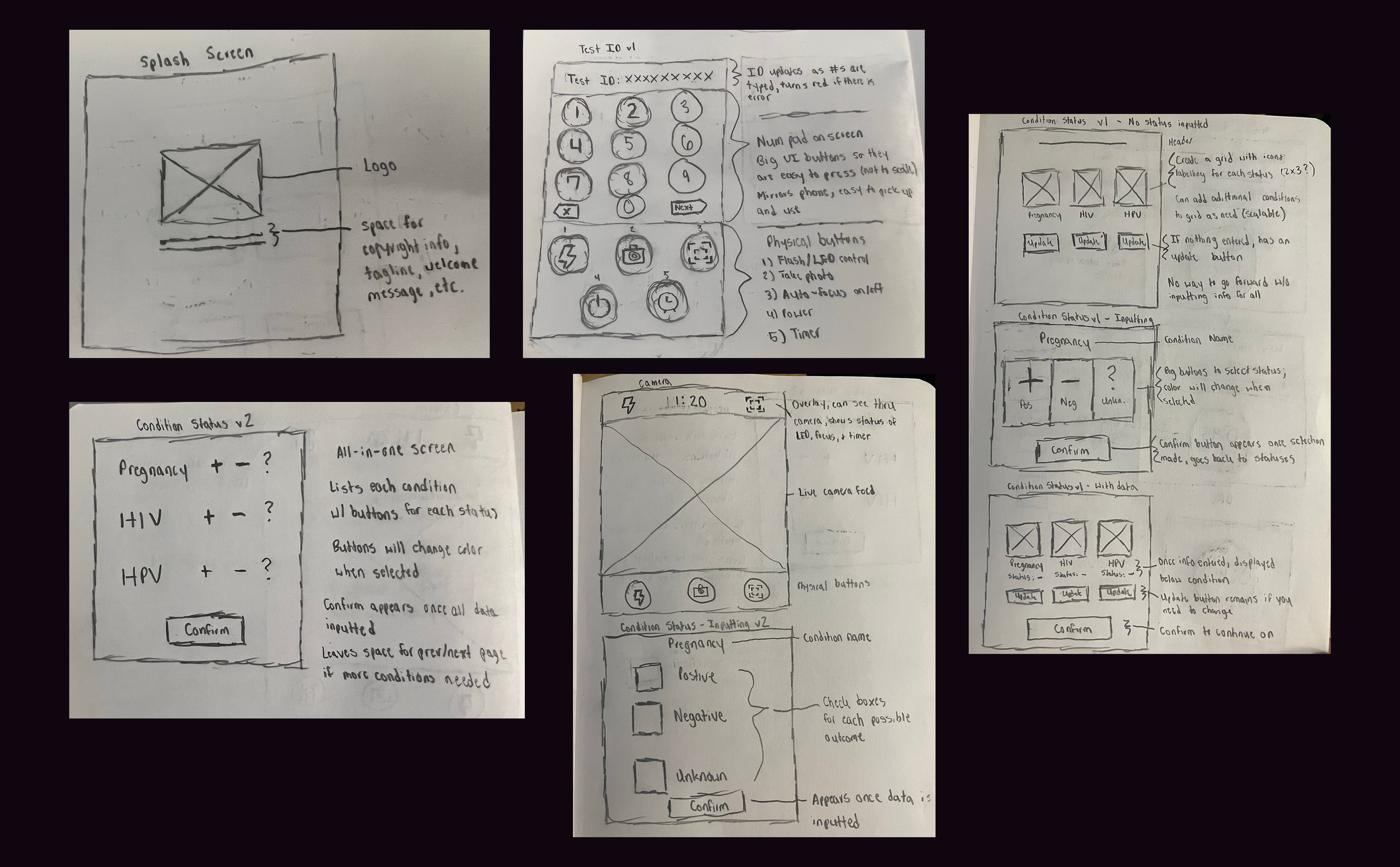
With the initial ideation completed, the hardware requirements came through, with the restriction being a 480x480 display resolution. A few screens needed slight refactoring. After a few rounds of iteration, the next version of the software was completed.
Conversion and Implementation
To bring our designs to life, we needed to translate Figma assets into a functional UI using SquareLine Studio. This process was essential because Figma alone doesn't support direct export to LVGL, the C library that powers our interface. This happened in three steps:
Export, organize, and upload all Figma assets into Squareline Studios
Recreate the UI so they are converted to LVGL-compatible components
Export the C code, which allowed us to attach the functional elements in the backend to the Figma assets on the frontend
Squareline Studios was a new tool for me, as well as the hardware team, so it was a learning experience for us all. After a few weeks of collaborative efforts, we were able to get our device up-and-running.
Learnings and Next Steps
The device is still in testing, but early feedback is promising. Clinicians report:
Faster, smoother exams – No more fumbling with gloves or needing extra hands.
Seamless integration – The intuitive design fits naturally into existing workflows.
Higher adoption potential – A purpose-built device inspires more trust than a repurposed phone.
As we continue refining the design, one thing is clear: solutions that align with real-world clinical needs drive meaningful impact.