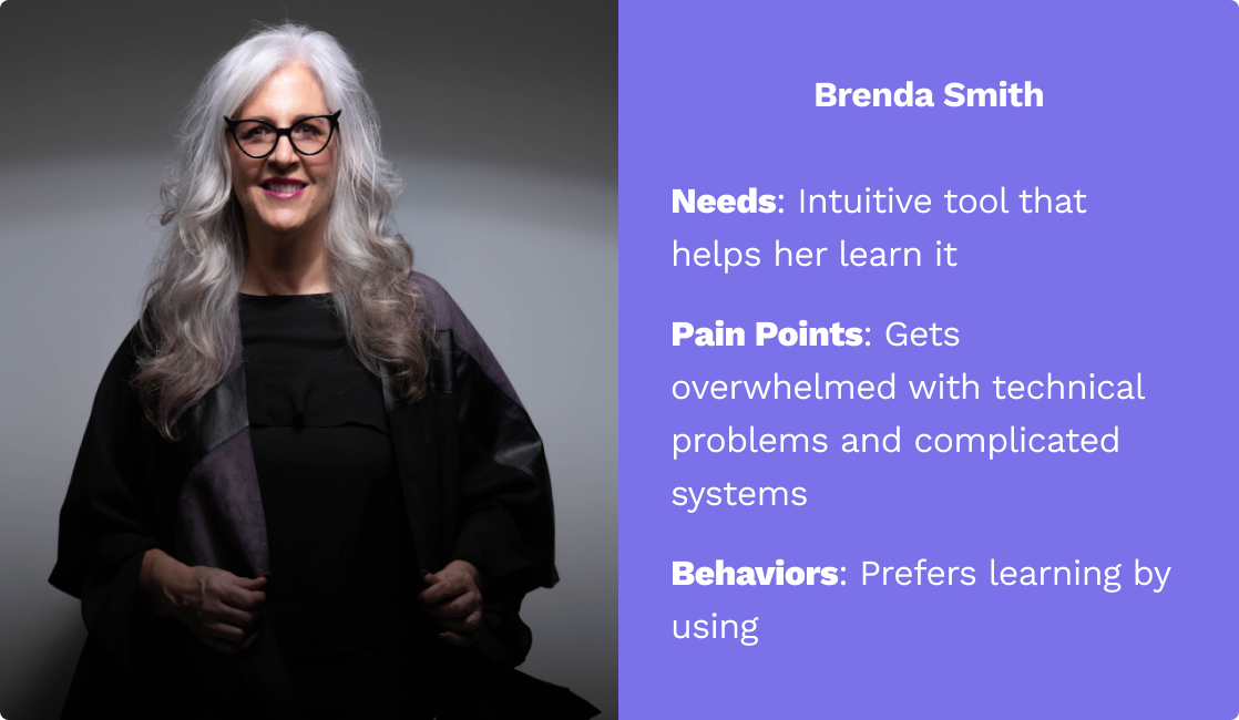
With a better picture of the pain points that different users were facing, it was time to narrow in on who we were designing for. To help, we created Brenda, our persona, to embody the needs and challenges our users were facing.
Emily acted as our north star throughout the rest of the design process. With her in mind, we were able to identify the problem we would be solving.
New User Onboarding for Good Work Hub - A Case Study
Good Work Hub is an AI-Powered granting-raising platform empowering charities to manage their teams, strategize their missions, and amplify their societal impact. Smaller charities and organizations with grants to give can both sign-up for the platform, enter their specific needs, and let AI find them a match. Additionally, it takes all of the traditional CRM features that are usually made for enterprises and gives them to charities to boost productivity and information flow.
Designers: Jake Richards | Jared McCleary | Nalani Bui
Duration: Three-week design sprint
Scope: Web application, working with Good Work Hub’s existing platform to create an onboarding experience
Responsibilities: User research, personas, sketches, wireframing, prototyping, usability testing
Tools: Figma, Maze, Google Workspace
Discovering and Defining the Problem
After meeting with the Good Work Hub team, we knew that our focus would be onboarding for new users of the CRM that would be doing work within the tool daily. Before getting started, we defined our criteria for what makes a delightful onboarding experience, giving us a benchmark to use for competitive analysis and to keep in mind when we started our designs:
Intuitive: The design should be intuitive, easy to navigate, and use language that doesn’t confuse the user.
Personalization: Tailor the onboarding process to the specific user role or department to increase engagement and retention.
Hands-On Walkthrough: Give users a hands-on walkthrough of how to use the tool during first-time use, and provide tutorials that are interactive as new features are discovered.
Quick Wins: Give users a "quick win" early on, so they can immediately see the value of the CRM.
Customer Support: Provide an easy way to get help, whether that is through resources, community forums, or directly speaking with someone.
Ongoing Training: Onboarding shouldn't stop after the first use. Evergreen resources, recurring training, or new resources as features are released.
These criteria were kept in mind as we conducted, contextual inquiries, competitive analysis, and comparative analysis to gain insights from current users, other CRMs, and other great onboarding experiences. After all was said and done, a few takeaways stood out:
“Emily needs to find a way to have easy and convenient access to eBooks while on the go because her business takes her on long flights and she needs a way to keep entertained.”
Designing and Iterating
With our problem defined, it was time to start settling on what our updated design would look like. As we were focused on the daily users of the CRM, our process would start from receiving an invitation to the CRM through the completion of onboarding. At a high-level, we knew that the flow would look something like:
Complete the redesigned sign-up form
Be prompted to start onboarding or complete it later
Walk through each function of the tool in whatever order the user chooses
Start browsing
We kept those steps in mind as we broke off individually to sketch our versions. After coming back together to see each other’s work, we took the pieces of each person’s sketches we liked to create a final version. With that, we were able to move into Figma and create low-fidelity wireframes to see everything to scale.

As we moved our design to high-fidelity, we received some early feedback from users on things that could be tweaked or things that weren’t aligning with their expectations:
First-time users don’t need a way to log-in
Make the search options clearer
Include a way to let users customize the books they see
The browsing experience doesn’t have the same offerings as a library would, such as curated collections and recommendations
We kept this all in mind as we moved to high-fidelity. Once we were there, we completed a round of usability testing with users via Maze, so we could make data-driven decisions for our last round of iterations. After going through our quantitative and qualitative data, and with an average SUS score of 96, we knew we were in a good place, but had a few small tweaks to make, which you can see in the full prototype.
Learnings and Next Steps
Working together in a UX team for the first time was a great learning experience. I learned two important things while collaborating with Nalani and Kiran. First, Kiran taught me how important it is to communicate effectively. She was really good at explaining design ideas and gathering feedback from others. I learned how to present my ideas clearly and convincingly from her. Second, Nalani showed me the importance of being adaptable. She was able to handle unexpected challenges and work quickly to meet deadlines. I learned the value of being flexible and open-minded when it comes to finding solutions. Overall, working with them taught me a lot about teamwork and how it can lead to better user experiences.
As far as next steps for Libby, we identified three areas that would be highest priority to work on:
Test and improve how content is downloaded and displayed
2
Improve the Product Description pages to provide more valuable information
3
Extend onboarding to the rest of the app to guide users through unfamiliar features
1
Functionality of different features was not aligned with user expectations
2
Lack of any onboarding or guides made it it difficult for users to know how to use the tool
3
Sign-up is easy, but lacks branding or messaging from the actual organization