
Account setup and app navigation were challenging,
2
Users want more than one way to link their library cards
3
Users value being able to explore the app before being forced to sign-up
1
With a better picture of the pain points that different users were facing, it was time to narrow in on who we were designing for. To help, we created Emily, our persona, to embody the needs and challenges our users were facing.
Emily acted as our north star throughout the rest of the design process. With her in mind, we were able to identify the problem we would be solving.
Redesigning Libby’s New User Experience - A Case Study
Libby is a mobile app for borrowing and reading ebooks and audiobooks from libraries, offering a user-friendly interface and personalized recommendations. Our team was challenged to identify and redesign a key feature of the app. After research, we concluded that our efforts would be best focused on the new user experience
Designers: Jake Richards | Kiran Komaragiri | Nalani Bui
Duration: Two-week design sprint
Scope: Native iOS application, starting from user research to an iterated high-fidelity prototype
Responsibilities: User research, personas, sketches, wireframing, prototyping, usability testing
Tools: Figma, Maze, Google Workspace
Discovering and Defining the Problem
During our research process, we conducted various methods such as contextual inquiries, competitive analysis, and comparative analysis to gain insights and identify areas for improvement in the Libby app. From our efforts, we learned a few key takeaways:

“Emily needs to find a way to have easy and convenient access to eBooks while on the go because her business takes her on long flights and she needs a way to keep entertained.”
Designing and Iterating
With our problem defined, it was time to start settling on what our updated design would look like. In its simplest form, we knew that the flow should allow Emily to:
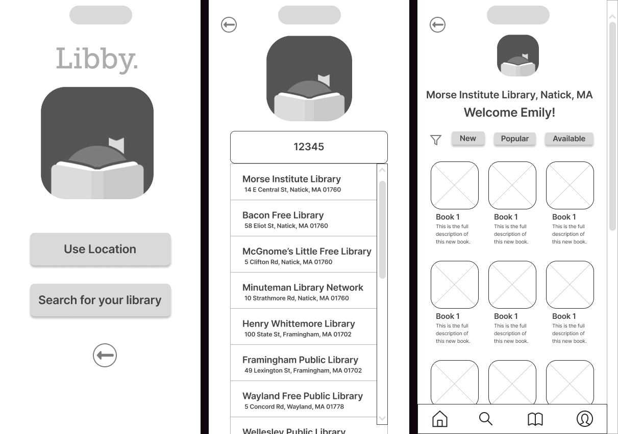
Find her library either by current location or by search
Link her card by number, phone, or any other way the library allows you to log-in
Indicate what types of books you’re interested in
Start browsing
We kept those steps in mind as we broke off individually to sketch our versions. After coming back together to see each other’s work, we took the pieces of each person’s sketches we liked to create a final version. With that, we were able to move into Figma and create low-fidelity wireframes to see everything to scale.

As we moved our design to high-fidelity, we received some early feedback from users on things that could be tweaked or things that weren’t aligning with their expectations:
First-time users don’t need a way to log-in
Make the search options clearer
Include a way to let users customize the books they see
The browsing experience doesn’t have the same offerings as a library would, such as curated collections and recommendations
We kept this all in mind as we moved to high-fidelity. Once we were there, we completed a round of usability testing with users via Maze, so we could make data-driven decisions for our last round of iterations. After going through our quantitative and qualitative data, and with an average SUS score of 96, we knew we were in a good place, but had a few small tweaks to make, which you can see in the full prototype.
Learnings and Next Steps
Working together in a UX team for the first time was a great learning experience. I learned two important things while collaborating with Nalani and Kiran. First, Kiran taught me how important it is to communicate effectively. She was really good at explaining design ideas and gathering feedback from others. I learned how to present my ideas clearly and convincingly from her. Second, Nalani showed me the importance of being adaptable. She was able to handle unexpected challenges and work quickly to meet deadlines. I learned the value of being flexible and open-minded when it comes to finding solutions. Overall, working with them taught me a lot about teamwork and how it can lead to better user experiences.
As far as next steps for Libby, we identified three areas that would be highest priority to work on:
Test and improve how content is downloaded and displayed
2
Improve the Product Description pages to provide more valuable information
3
Extend onboarding to the rest of the app to guide users through unfamiliar features